
Paul Lukas (columnist for ESPN.com's "Uni Watch"): We really can't get enough of them. And like Lukas, we think a lot of teams are making disastrous mistakes these days.
We thought we'd start this off with the "Top 5 College Football Helmets We Miss":
5. Arizona Wildcats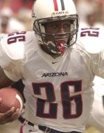
Skinny: Revolutionary for its time, this helmet brought asymmetry to the game. We love the opposing red and blue stripes down the middle.
New look: Too "sleek"...
4. Oregon Ducks
Skinny: Gotta respect the yellow dome on this piece. I recall Kirk Herbstreit calling these the ugliest uniforms in college football...
New look: ... But then again, he hadn't seen these.
3. San Diego St. Aztecs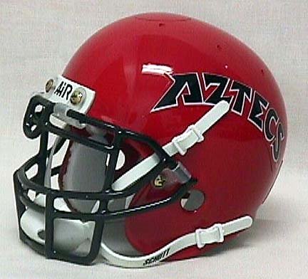
Skinny: Not that we know anything about Aztecs, but we feel confident saying this helmet looks like an Aztec designed it. The school had to be crazy to change a helmet that Marshall Faulk wore.
New Look: Who decided to put a gradient on this thing???
2. Pitt Panthers
Skinny: Like Oregon, the yellow dome just catches your eye - especially when it has that mustard look. And like San Diego St., school must realize you never change the helmet when a legend (Dan Marino) donned the look.
New Look: Very similar to the ugliest dog in the world.
1. Hawaii Rainbows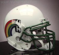
Skinny: These just blow our minds every time we see them. We love the green grill and the decal's low location. It takes a tremendous amount of balls to play with a rainbow on your helmet.
New Look: It could be worse, but why mess with perfection?
4.20.2006
"Don't Call It a Comeback": Part 1
Subscribe to:
Post Comments (Atom)
No comments:
Post a Comment